
Apple
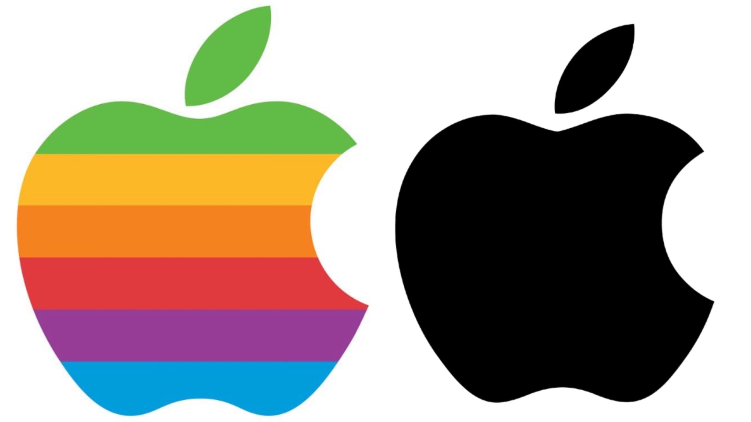
Apple has always positioned itself as a company on the cutting edge of technology, but its look has changed considerably over the years. In the 80s, Apple embraced bold colours in both their logo and products, whereas these days the company emphasizes a monochromatic, sleek colour palette consisting mostly of grey, white, silver and black.
WPP

At the start of the 80s, WPP was still doing what it had been founded to do in 1971: manufacture wire baskets. Throughout the decade, however, the company began a campaign of aggressive acquisitions, and in 1987 it purchased Scott Stern Associates, an advertising agency based in Scotland. In the 90s, WPP abandoned basket manufacturing altogether, and the brand is now the largest advertising company in the world.
Kodak
In the 80s, Kodak was the reigning champion of the consumer photography space, making fortunes selling cameras and film. The company deliberately chose not to adapt to the rise of digital photography – fearing it would harm their film sales – but this proved to be a mistake that led to a bankruptcy filing in 2012. Kodak managed to survive, however, and these days it provides commercial digital photo printing services.
Yellow Pages
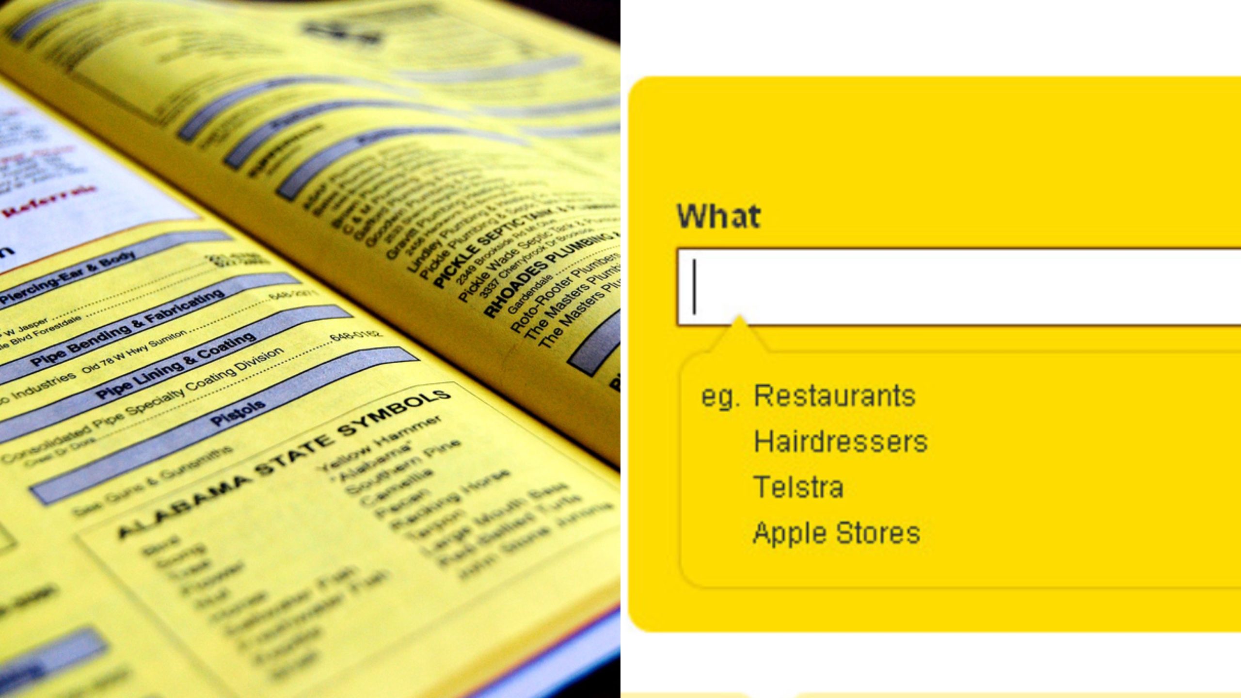
In the 80s, virtually every household had a copy of the Yellow Pages. Once easy access to the internet became widespread, however, the Yellow Pages were rendered more or less obsolete. In 2019 – after years of declining ad revenue – the company finally made the decision to ditch its paper edition, becoming an entirely online service.
Nokia
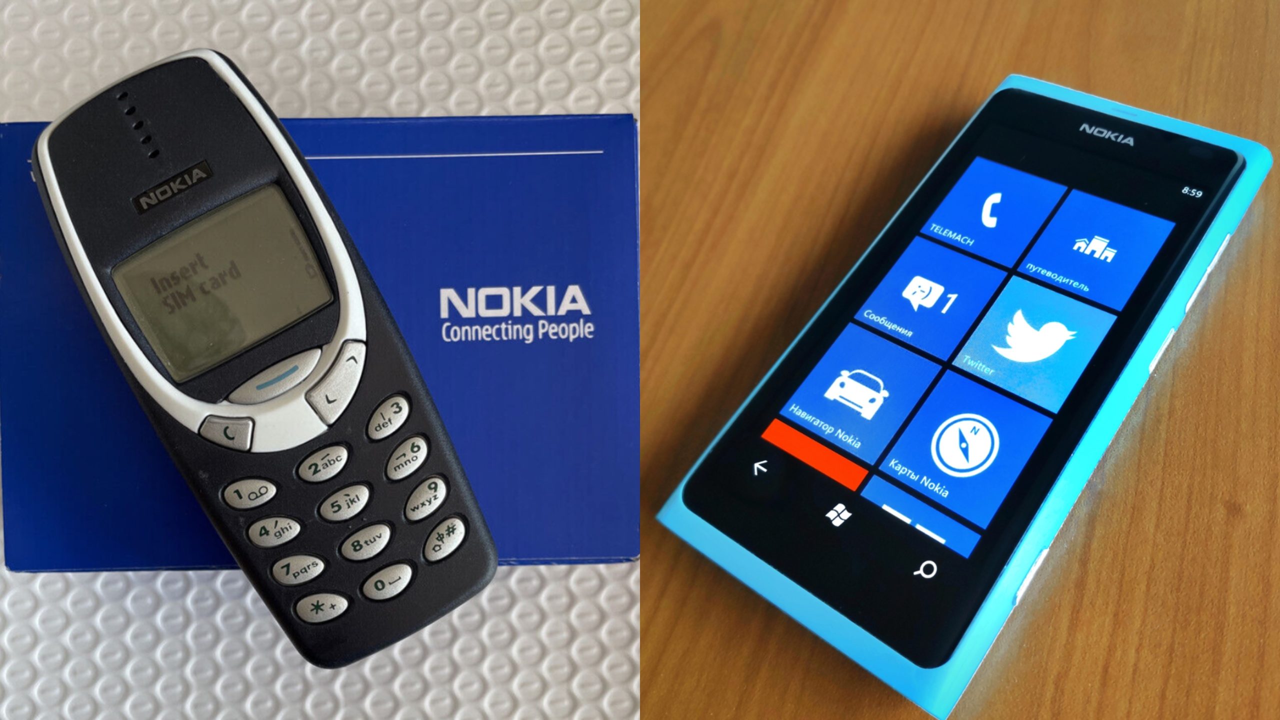
Founded in 1865 as a pulp mill, Nokia had become a global company by the 1960s, and in the early 80s, it entered the telecommunications industry through a series of acquisitions. After becoming arguably the most popular mobile phone manufacturer in the world, Nokia began to decline in the 2000s, and the company now only exists as a subsidiary of Microsoft.
Stüssy
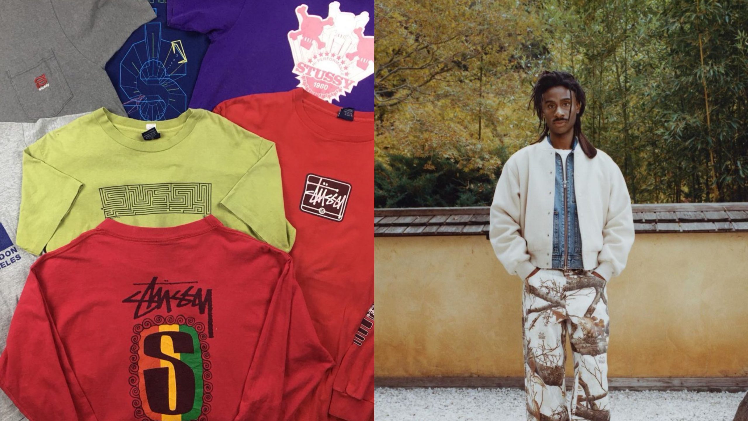
Born out of California’s surf scene, Stüssy quickly became one of the most iconic brands of the 80s, and its scribbled logo became a ubiquitous sight. While its popularity is less widespread these days, Stüssy is still considered an iconic brand, and it’s been adopted by the skater and streetwear communities. Their aesthetic has similarly shifted to be less brash and more subtly stylish.
Starbucks
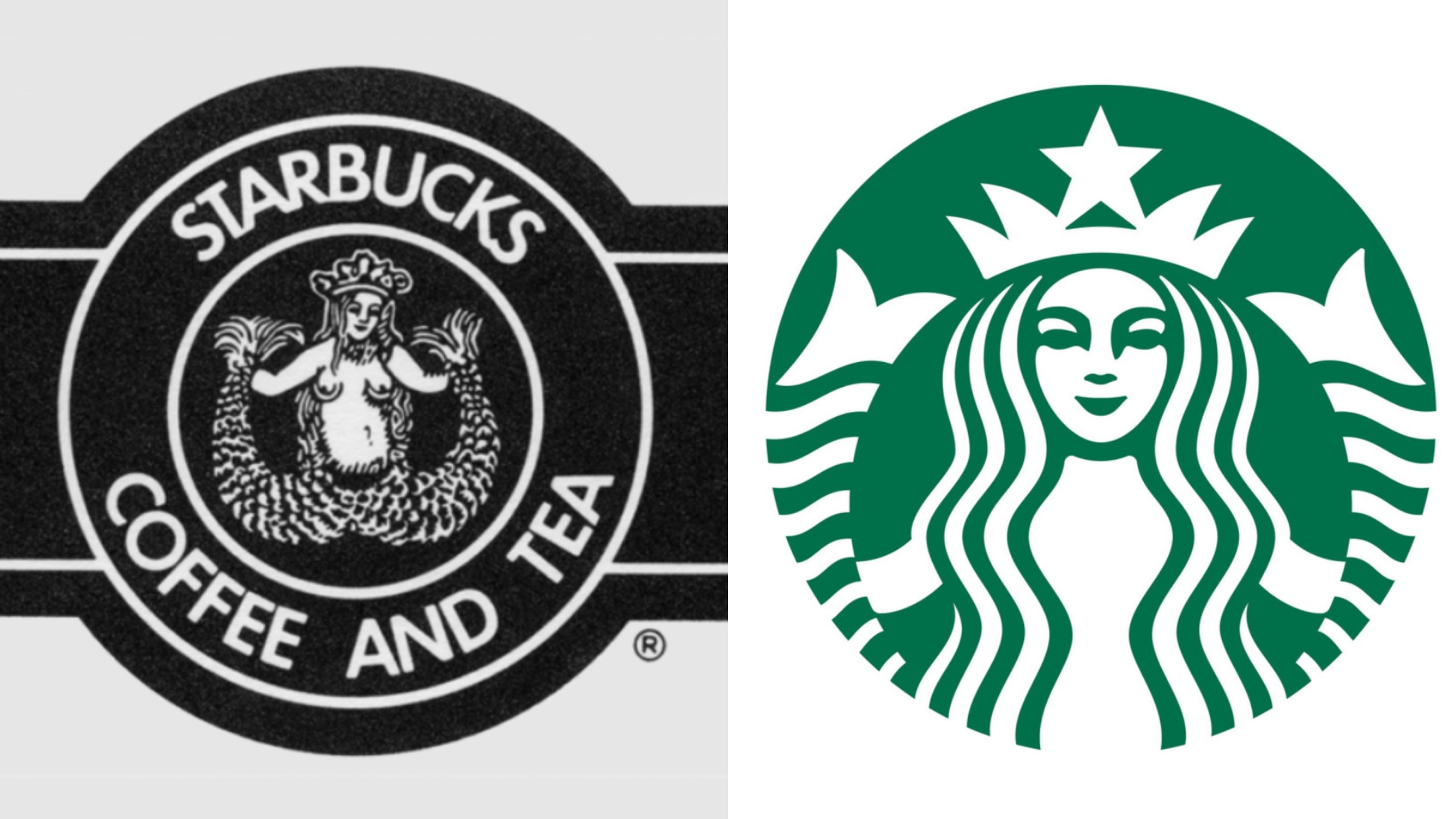
Starbucks was founded in 1971 as Pequod, although the company’s directors quickly realized this was a terrible idea and changed it to its current name (both are references to the novel Moby Dick). The first Starbucks logo was certainly eye-catching, but not in a good way, and at the tail-end of the 80s the company adopted the logo which is still used today.
Ocean Pacific
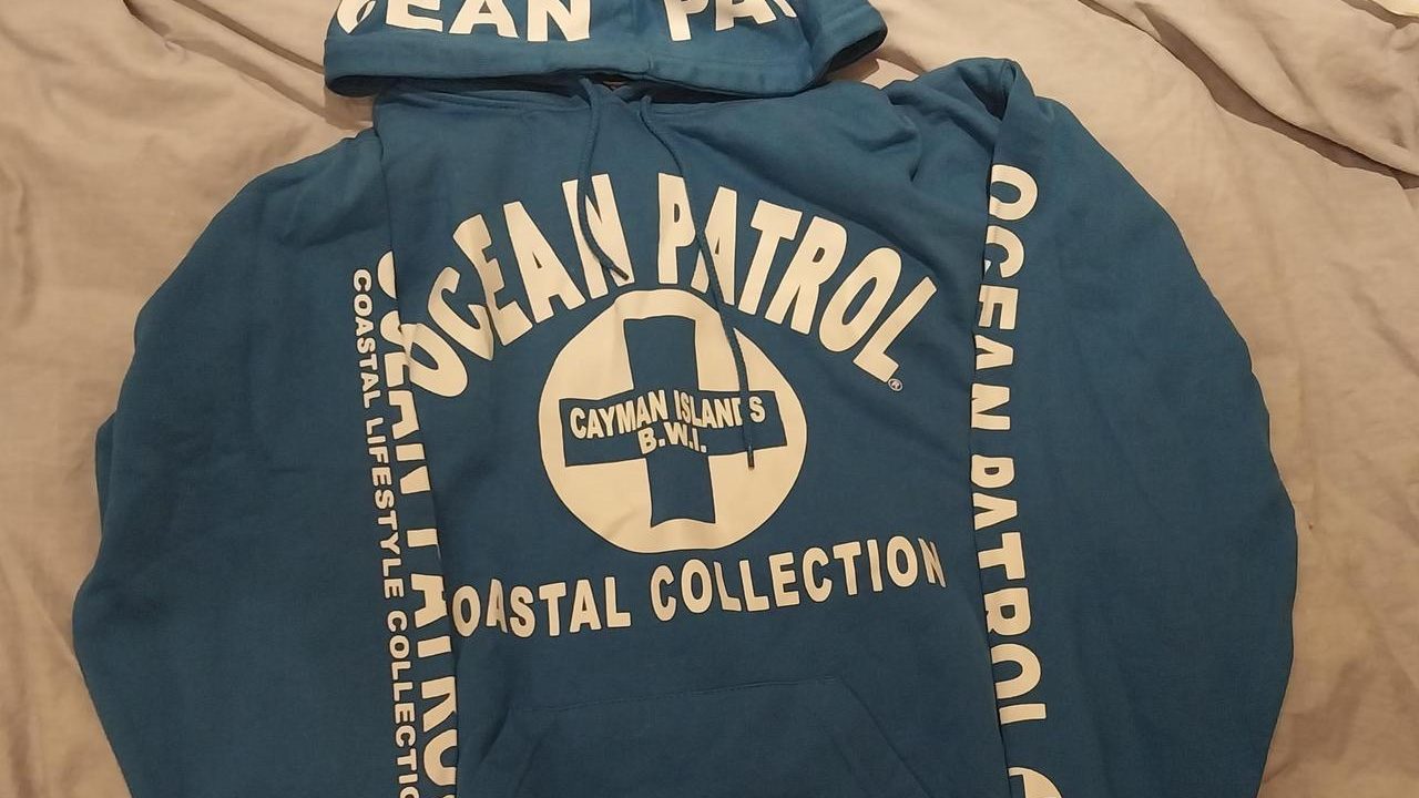
Another clothing brand that grew out of 80s surf culture, Ocean Pacific was all the rage for a number of years. The brand failed to ride the wave of changing trends, however, and it was eventually all but forgotten. Ocean Pacific is currently owned by Iconix Brand Group, and – in a sign of how far this once-edgy brand has fallen – its clothes can now be found for sale in Walmart.
Chevrolet
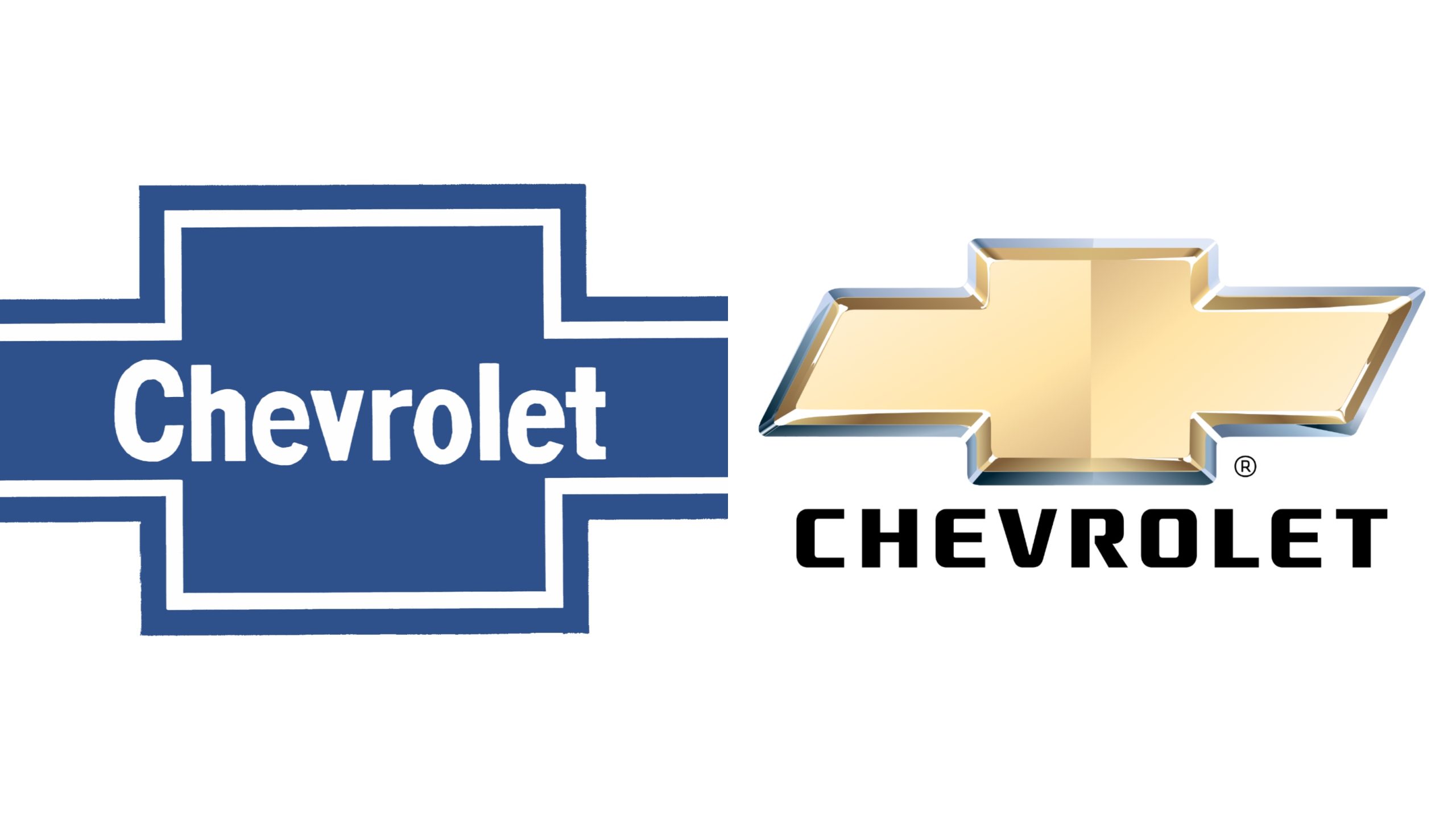
Chevrolet added the iconic cross to its logo in 1914, three years after the company was founded. During the 80s, Chevrolet’s logo consisted of a simple blue cross with the company’s name in the centre, but in 2008 the design was significantly revamped, with striking gold colouration and a 3D effect added to imply luxury and exclusivity.
Ralph Lauren
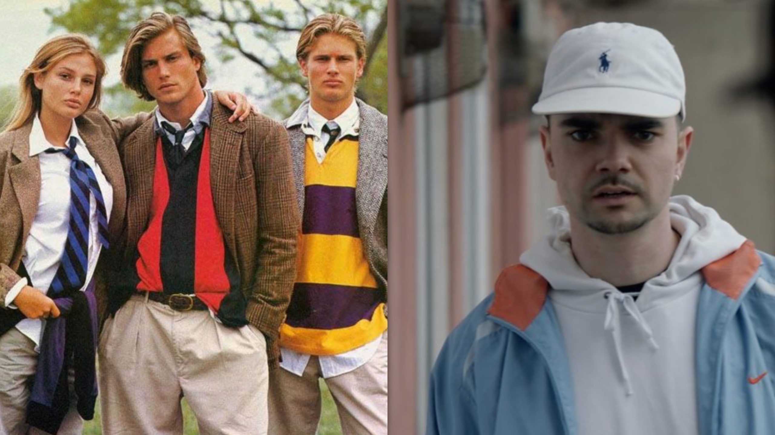
When Ralph Lauren founded his eponymous clothing brand in 1967, he envisioned it as a high-end luxury fashion company. The brand maintained this image well into the 80s, with the cost of its products ensuring it was only worn by the wealthy. These days – while Ralph Lauren is still an expensive brand – it has been fully adopted by the streetwear community, and it is increasingly seen as edgy, not preppy.
IBM
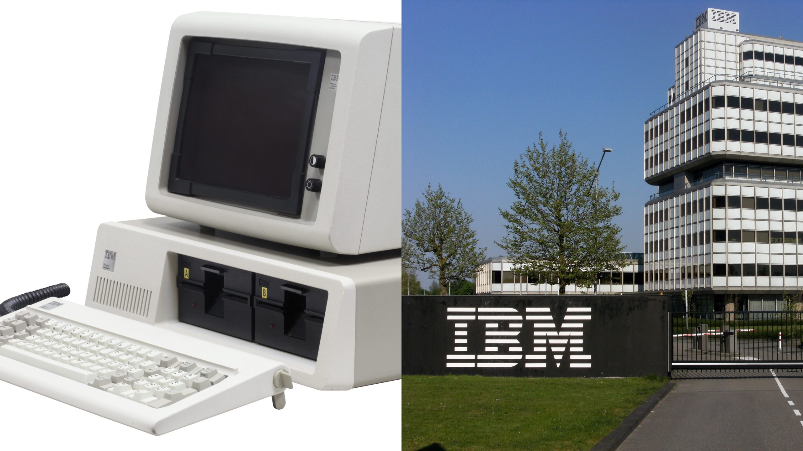
In 1981, IBM manufactured its first personal computer, and throughout the rest of the decade, the company became one of the global leaders in consumer computing. While the company’s offerings were renowned for their quality, they were far more expensive than their competitors, and by 1991 IBM’s market share had dropped from 80% to 20%. These days, IBM focuses on software and commercial services, particularly cloud computing.
Amazon
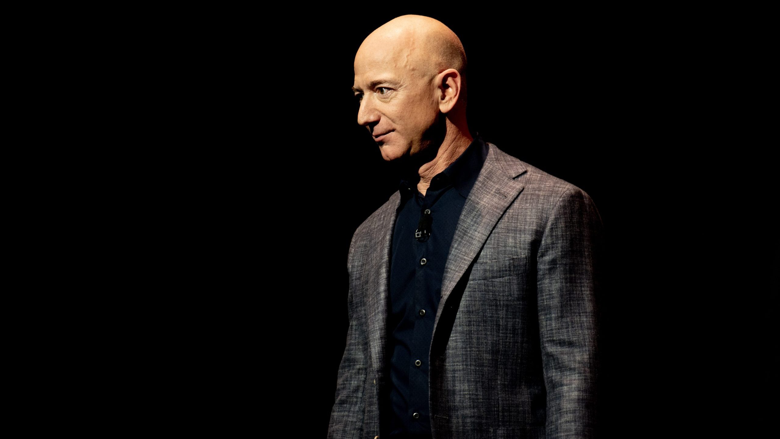
At the end of the 80s, Jeff Bezos was starting to formulate plans for an online platform for book sales. That platform would, of course, become Amazon, but the first name Bezos came up with was Cadabra. After trying to make it stick for a few years, Bezos gave up – largely because people kept mishearing it as ‘cadaver’ – and he adopted the name which the company still uses today.
Baskin Robbins
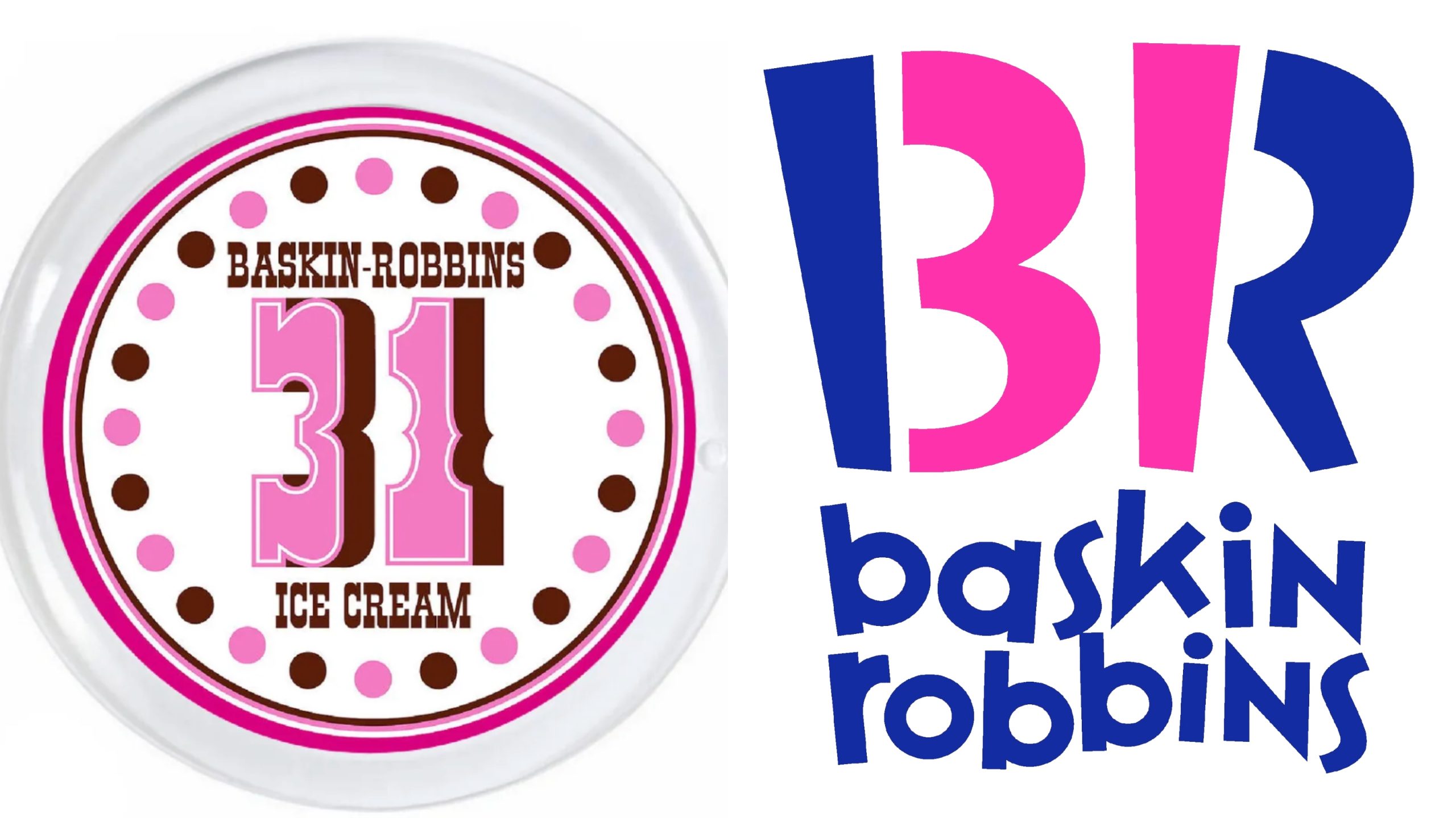
Founded in 1945, Baskin Robbins stuck with its original logo – which included ’31’ to indicate how many flavours the company offered – for over 50 years. Then, in 2006, the company adopted its new logo, which dropped the words ‘Ice Cream’ and made the 31 less obvious. The reason was simple: by this point, Baskin Robbins was such an established brand that the additional info just wasn’t necessary.
KFC
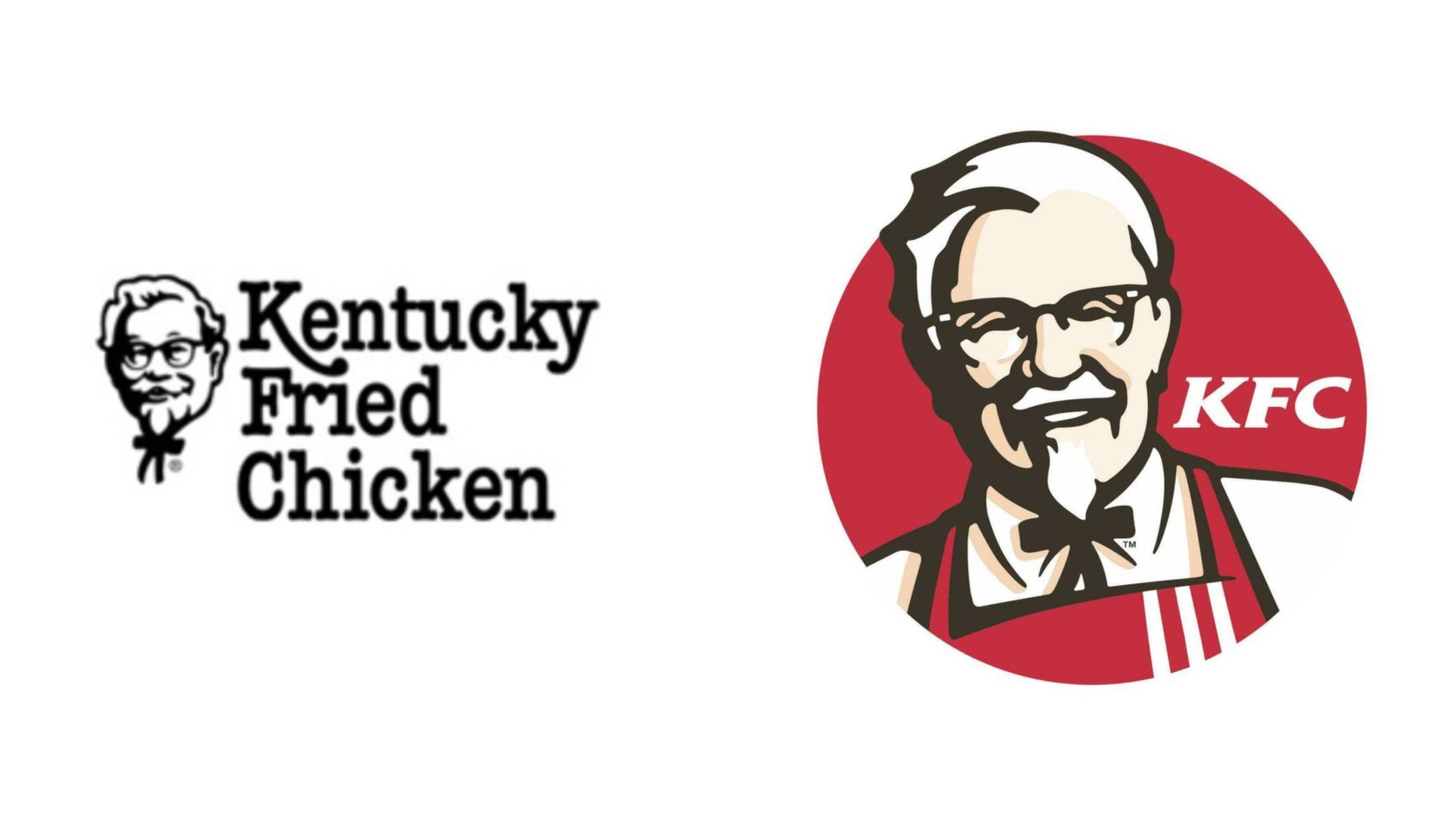
Even though the abbreviation had been used for decades, KFC was technically called Kentucky Fried Chicken until 1991. When the company formally changed its name, it spawned wild conspiracy theories that the company was using genetically modified livestock so physically different from real chickens that they couldn’t legally use the word ‘chicken’ in their branding anymore.
Ikea
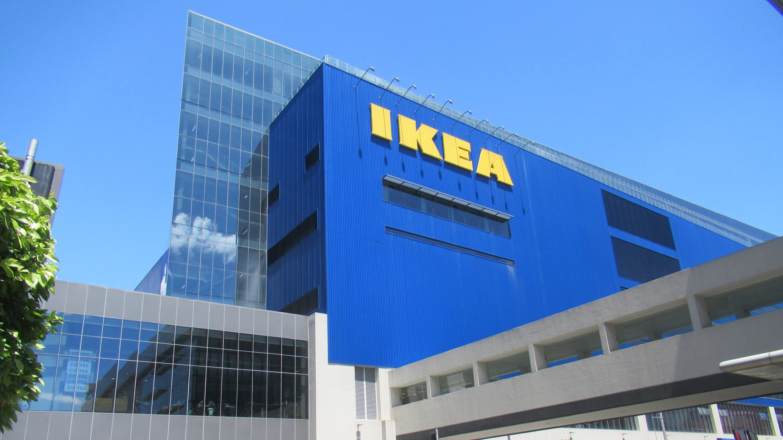
Founded by 17-year-old Ingvar Kamprad in 1943 as a mail-order furniture business, by the 1980s Ikea had expanded to a number of countries outside of Sweden, including the United Kingdom, Germany and Japan. Since then, the company has continued to spread worldwide, with stores in 59 countries and three territories.
Pepsi
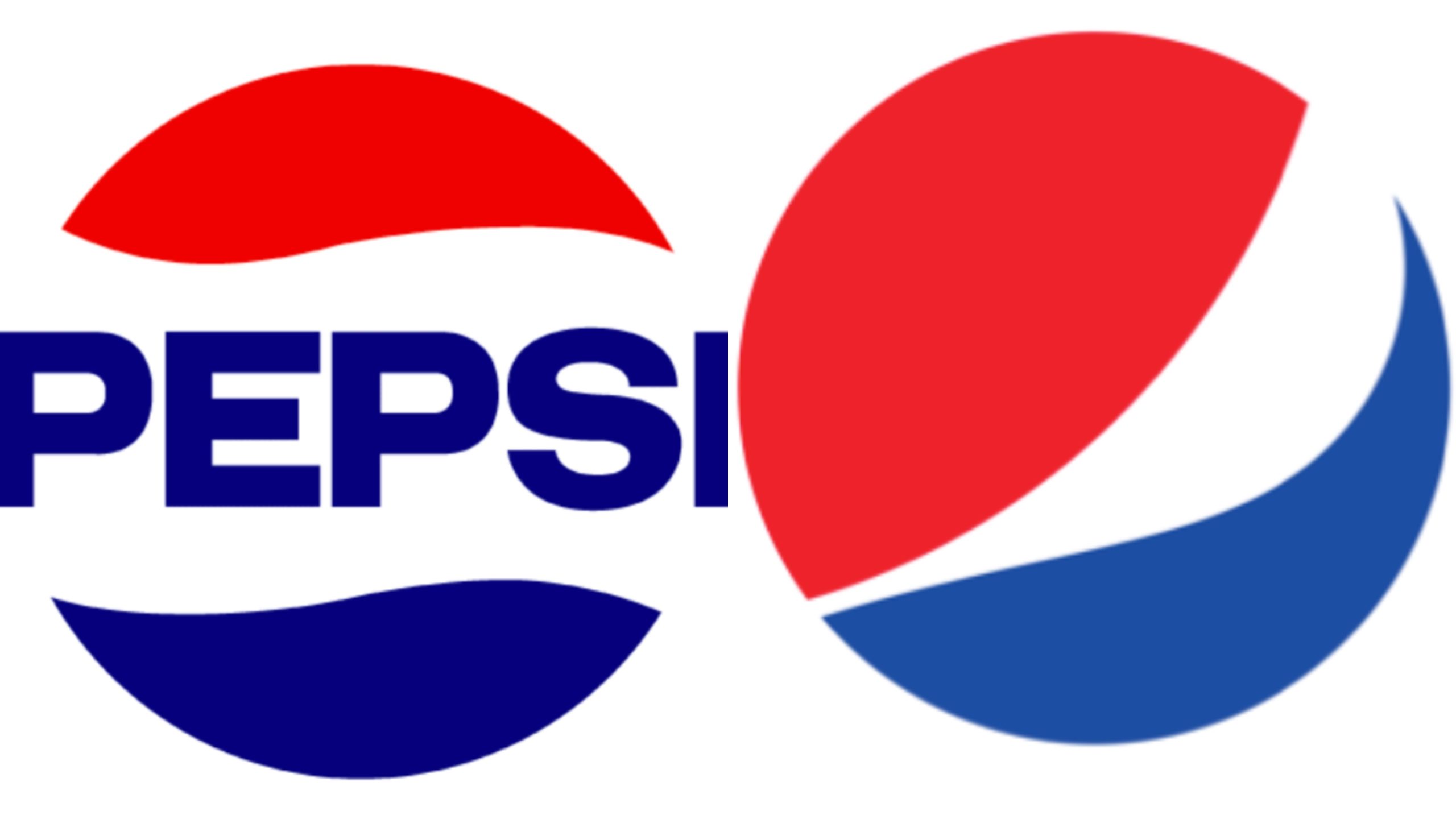
The Pepsi logo has changed a number of times throughout the company’s long history. In the 50s, Pepsi adopted the red, white and blue colour scheme that it still uses today, attempting to position itself as a rival to Coca-Cola. In 2008, the company redesigned its logo again to make it more up-to-date, simultaneously ditching the bold capital letters it had previously used.
Guess
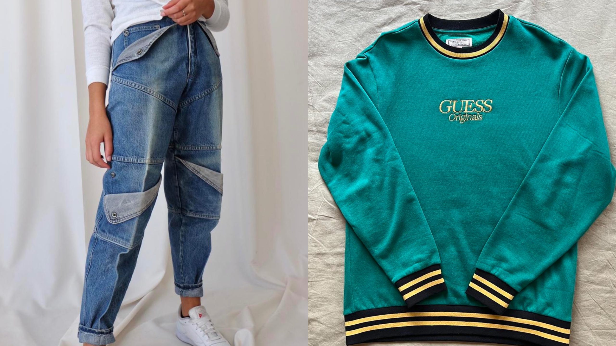
Founded in 1981, Guess originally only made jeans, with the company adding other denim products – like jackets and shirts – in the years that followed. While the company still manufactures jeans, these days it is more known for its high-end streetwear offerings, which include jumpers, t-shirts and other apparel.
Berkshire Hathaway

Berkshire Hathaway is arguably the most famous investment firm in the world, but it was actually founded in 1839 as a textile manufacturing company. It was only in 1985 – a full two decades after Warren Buffett took over the company – that Berkshire Hathaway closed its last textiles plant to fully focus on insurance, investing and real estate, which remain the cores of its business today.
Weight Watchers
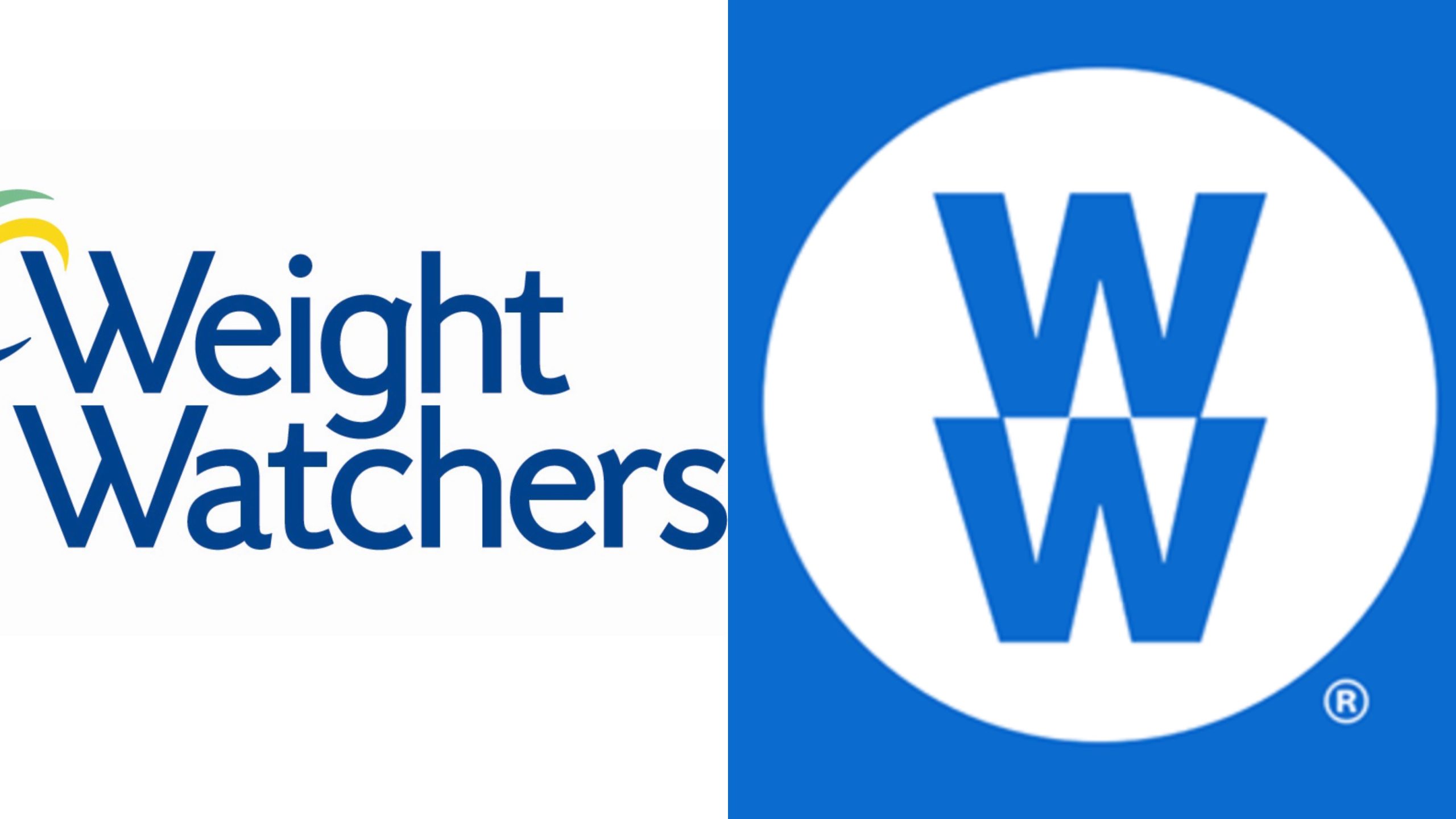
Founded in 1963, Weight Watchers quickly became one of the most popular diet plans in the world, thanks to its emphasis on portion control over cutting out foods. In 2018, the company rebranded itself as WW – completely changing its logo in the process – to shift its focus onto generally healthy lifestyle choices, rather than exclusively focusing on losing weight.
Snickers
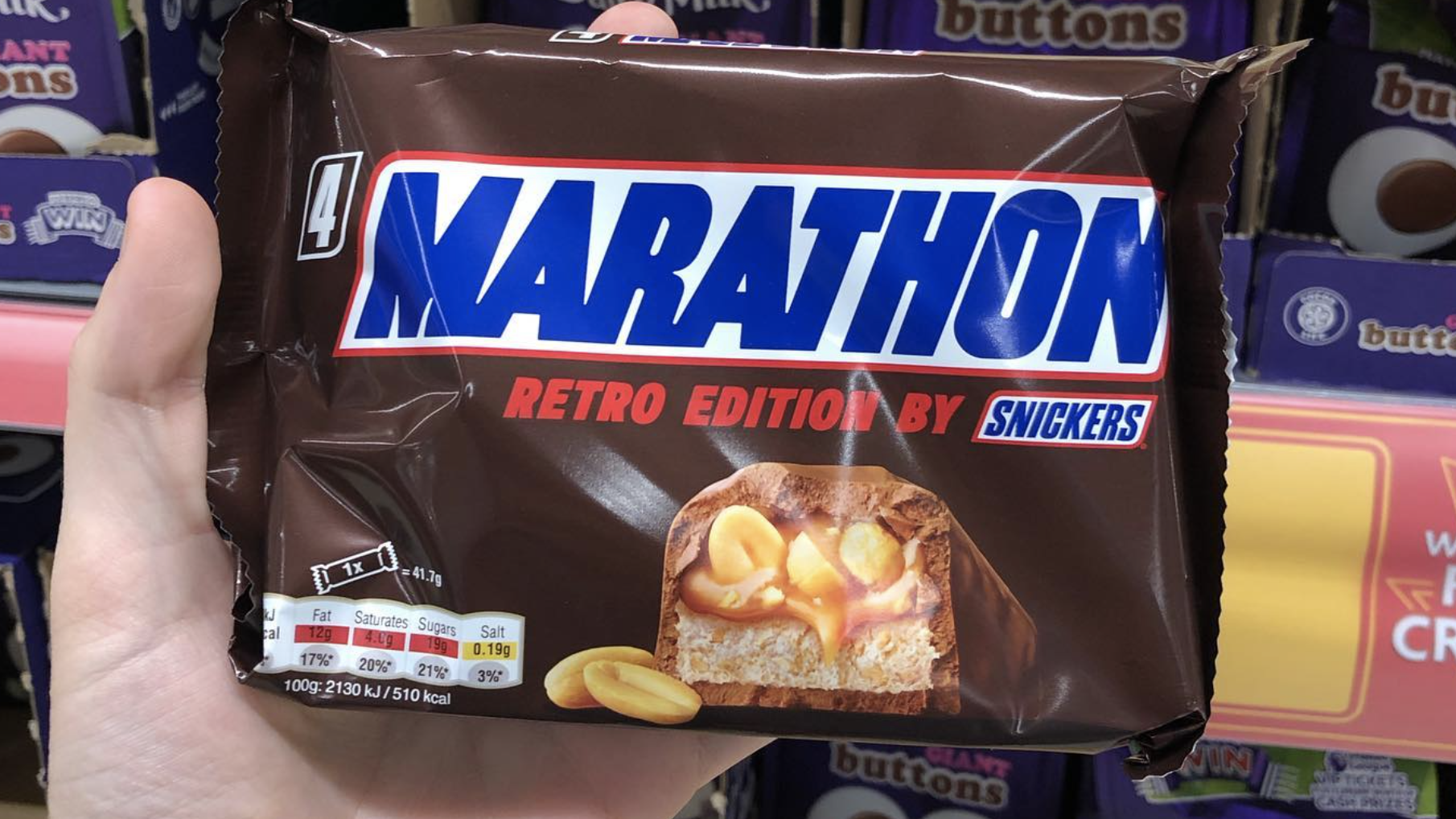
First introduced in 1930, the Snickers bar was named after the Mars family’s favourite horse. In the UK and Ireland, however, Snickers were sold under the name Marathon, in an attempt by marketers to make the bars seem healthier. In 1991, Mars, Incorporated decided to change the name back to Snickers to bring it in line with its global marketing efforts.
Altria
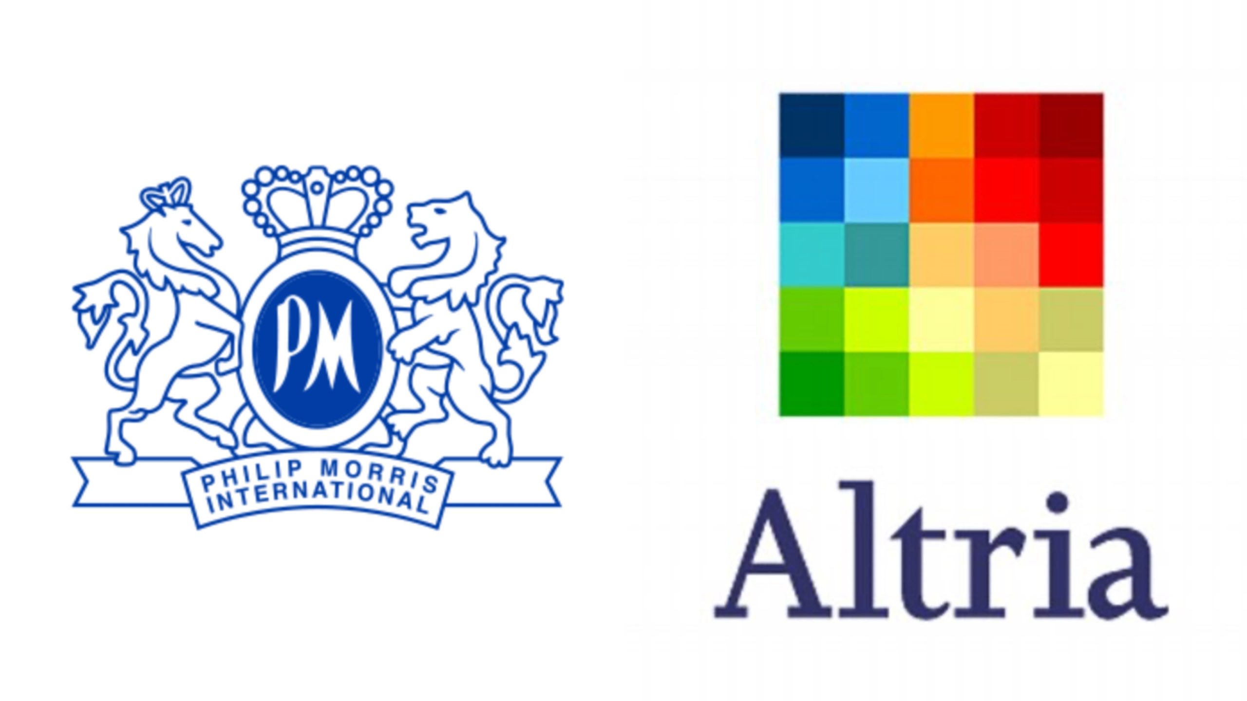
One of the largest manufacturers of tobacco in the world, Philip Morris consistently downplayed the risk of smoking throughout the 80s. Finally, after a lawsuit was brought against the company in 1999, it ditched its deceptive marketing practices. In 2006, Philip Morris changed its name to Altria, in a move many assumed was intended to create distance from the brand’s sordid past.
Pringles
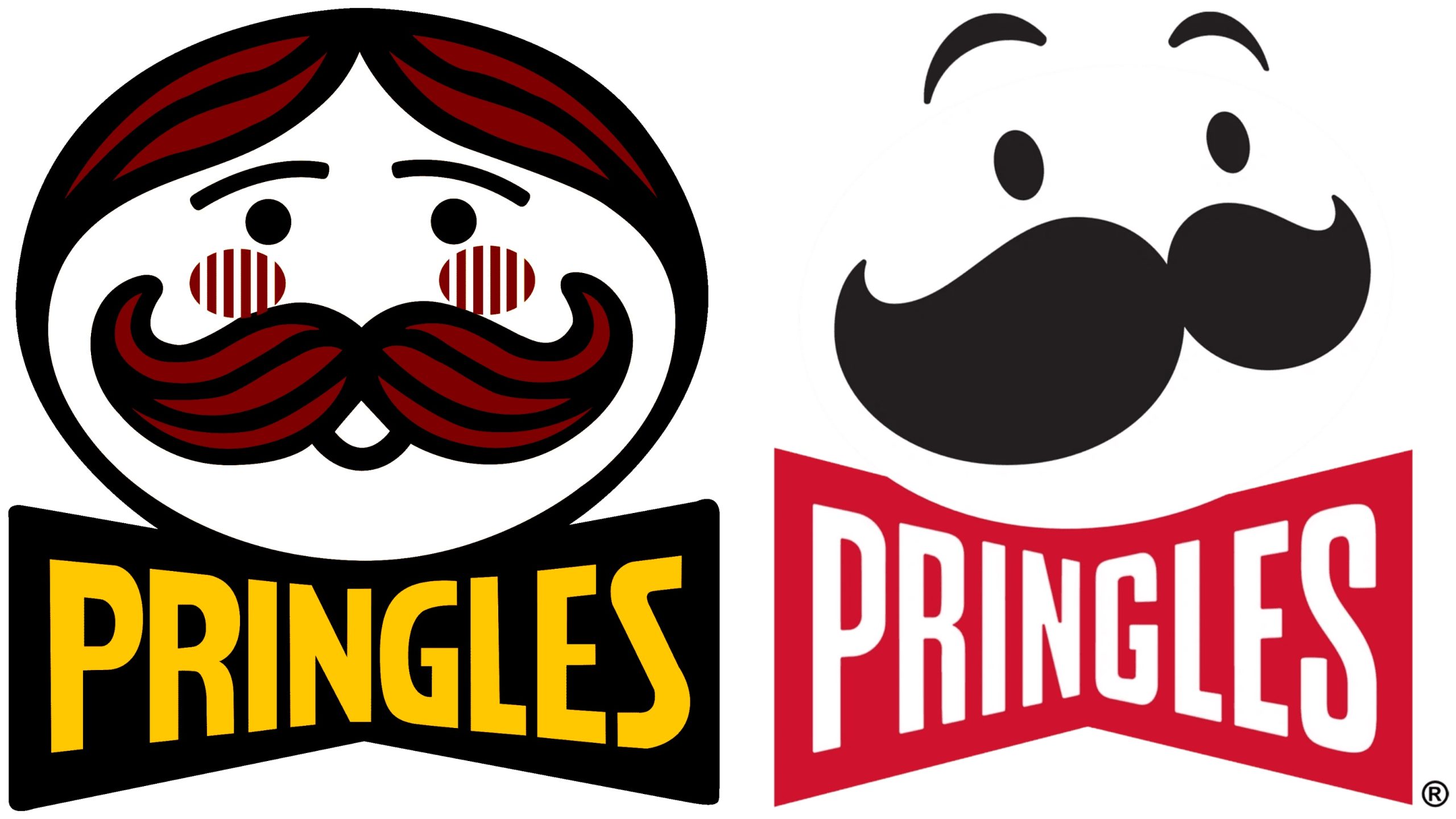
Pringles first started incorporating the moustached Julius Pringles into its logo in 1967, and the face has now become synonymous with the brand. In 2020, the logo received a radical redesign that removed the outline of Julius’ head – as well as his hair – leaving just his eyes, eyebrows, and, of course, his trademark moustache.
AOL
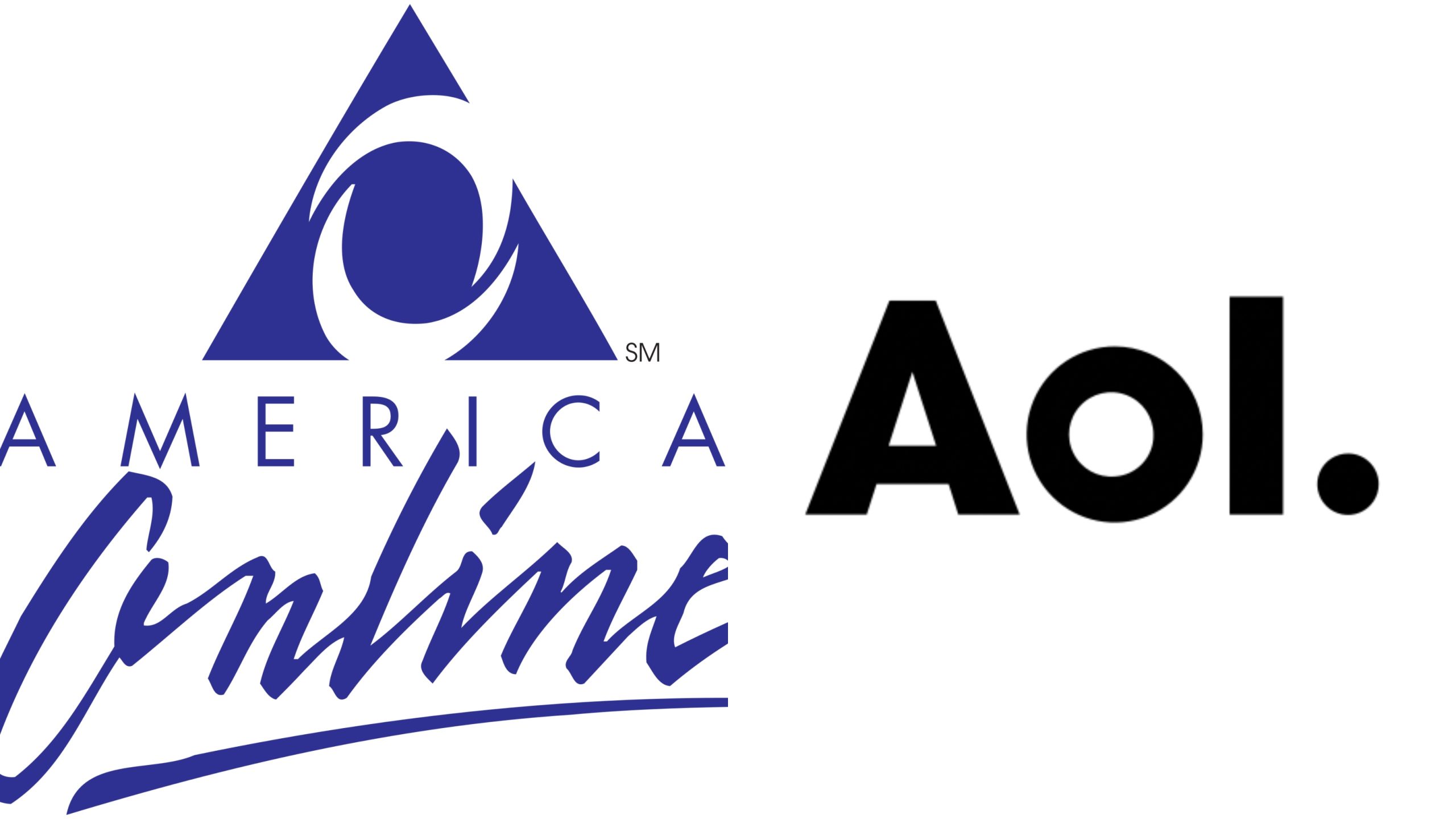
In 1985, Jim Kimsey founded Quantum Computer Services, a company which provided online services to businesses. Six years later, the company was renamed America Online, in an attempt to widen its mainstream appeal. Finally, in 2006, the company formally rebranded itself to AOL, a name it continues to use today.
Best Buy
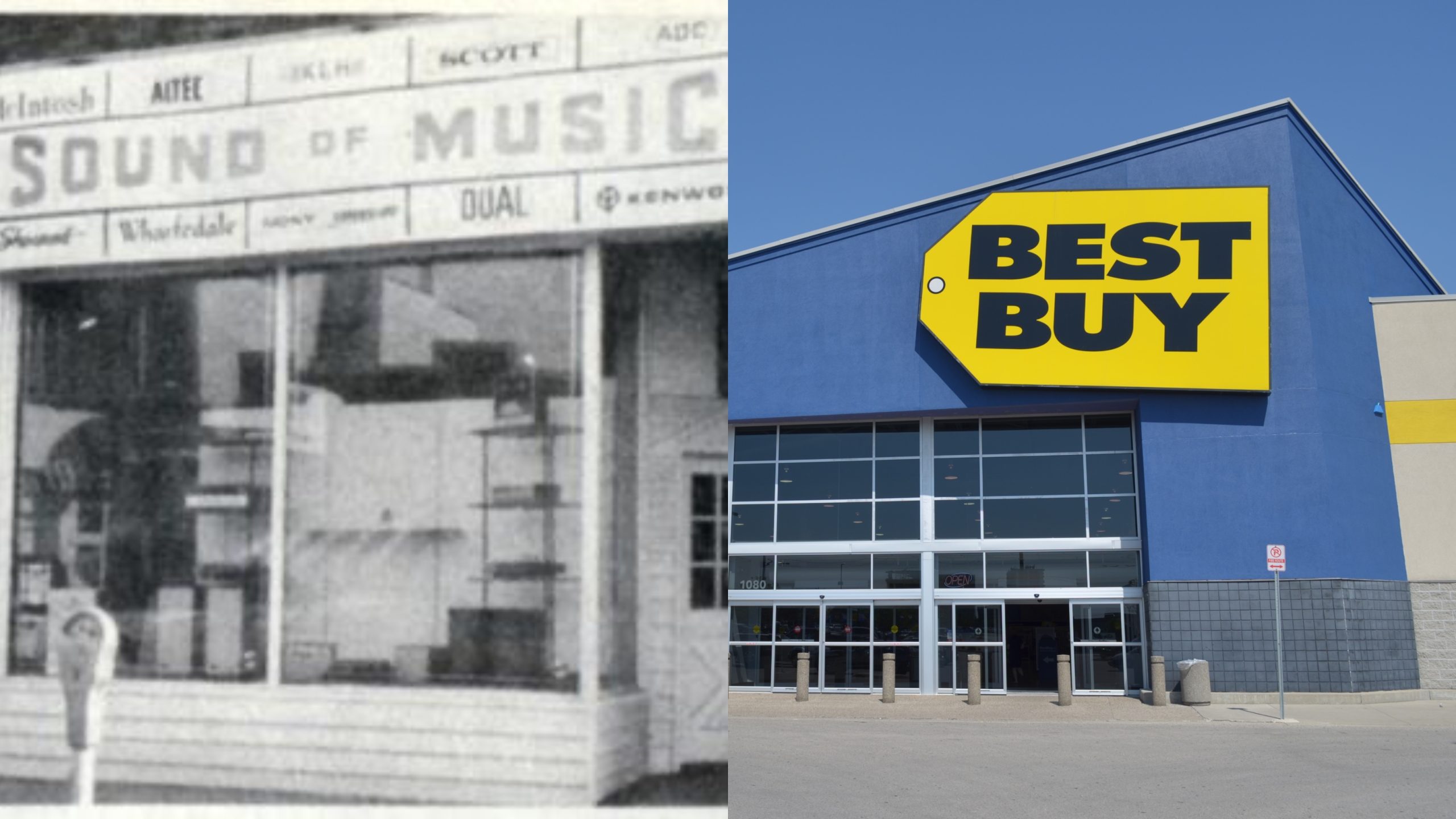
In 1981, the flagship store of high-end stereo retailer Sound of Music was hit by a tornado. In an attempt to shift damaged but functional stock, the company held a sale in its parking lot, announcing “best buy” prices on all products. The sale proved to be a resounding success, and the company officially changed its name to Best Buy within a few years. It has not looked back since.
Papa John’s
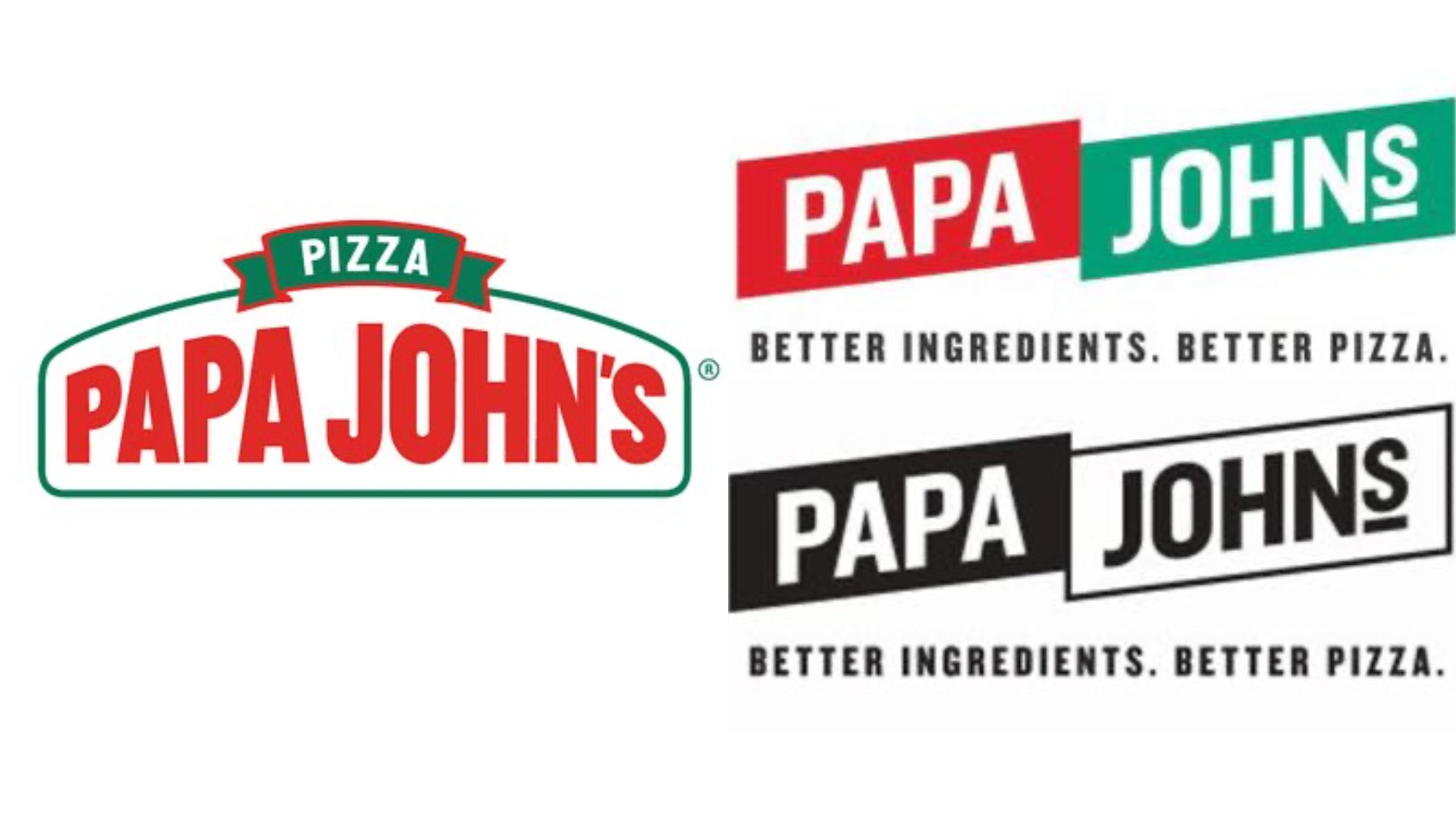
Founded in 1984 by John Schnatter, Papa John’s kept the same logo for most of its history. In 2018, however – after Schnatter was forced out of the company amidst a string of damaging scandals – Papa John’s decided to rejuvenate their logo, simplifying the font and adding the words better ingredients, better pizza. They also released a black-and-white version, in a move to distance themselves from Schnatter’s actions and words.
BlackBerry
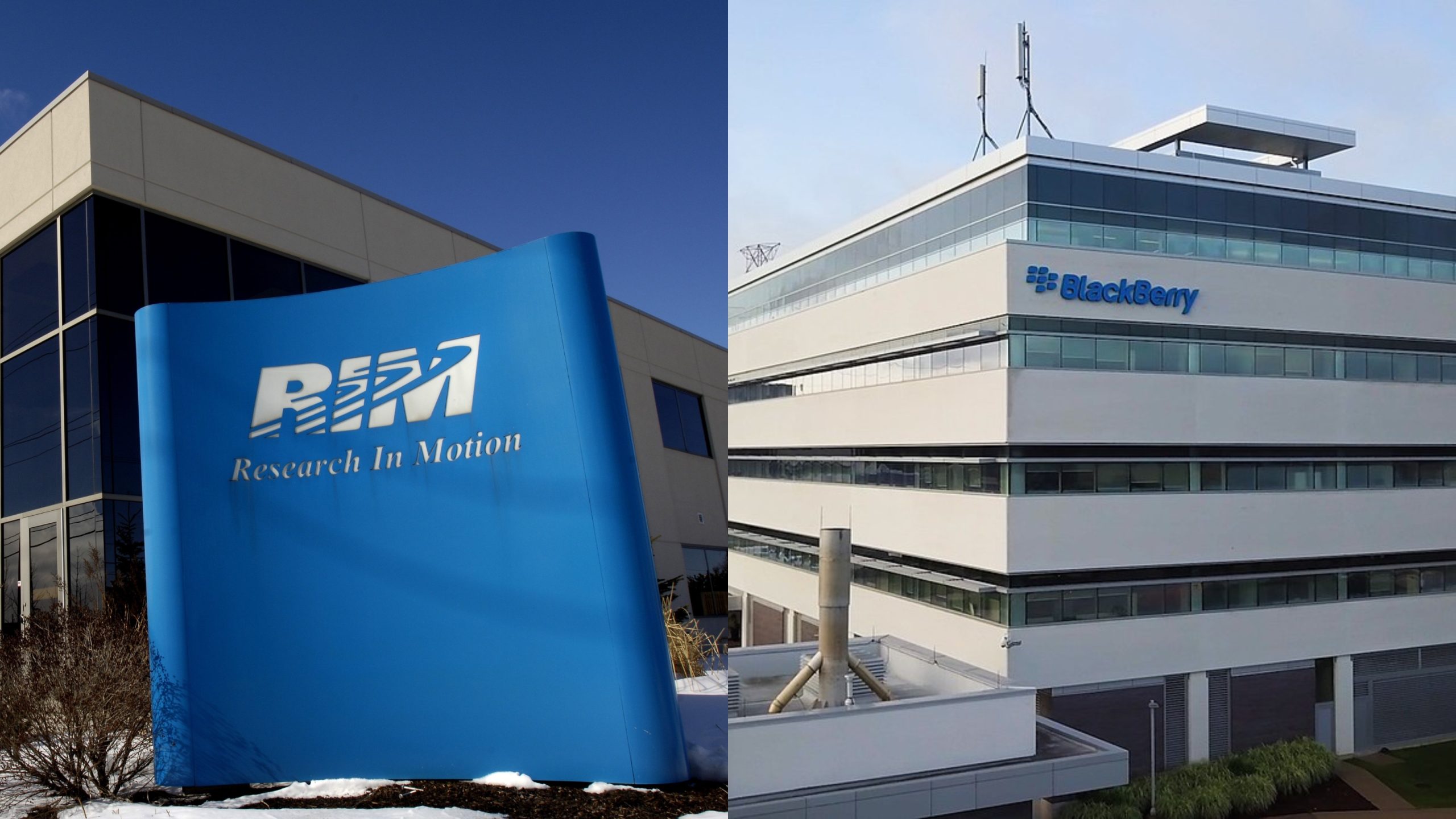
Research in Motion was founded in Ontario, Canada in 1984, becoming the first wireless data technology company in North America. In 1999, RIM started manufacturing its BlackBerry mobile phones, which quickly became a global sensation thanks to their unique keyboards and privacy software. In 2013, the company officially changed its name to BlackBerry, but – after years of declining sales – the company is now focused on data protection services.
Starburst
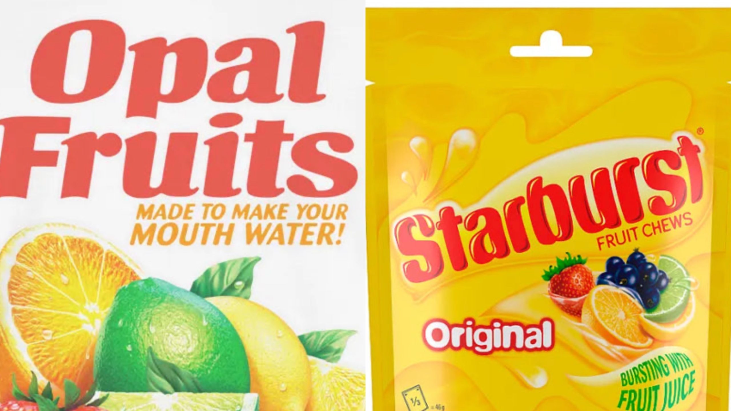
Produced by The Wrigley Company – a subsidiary of Mars, Incorporated – Starburst was originally sold in the United Kingdom under the name Opal Fruit. When the candy was introduced to American markets in the late 80s, it was sold as Starburst, and in 1998 Opal Fruits was officially renamed to standardize Mars’ global offerings.
Dunkin’ Donuts
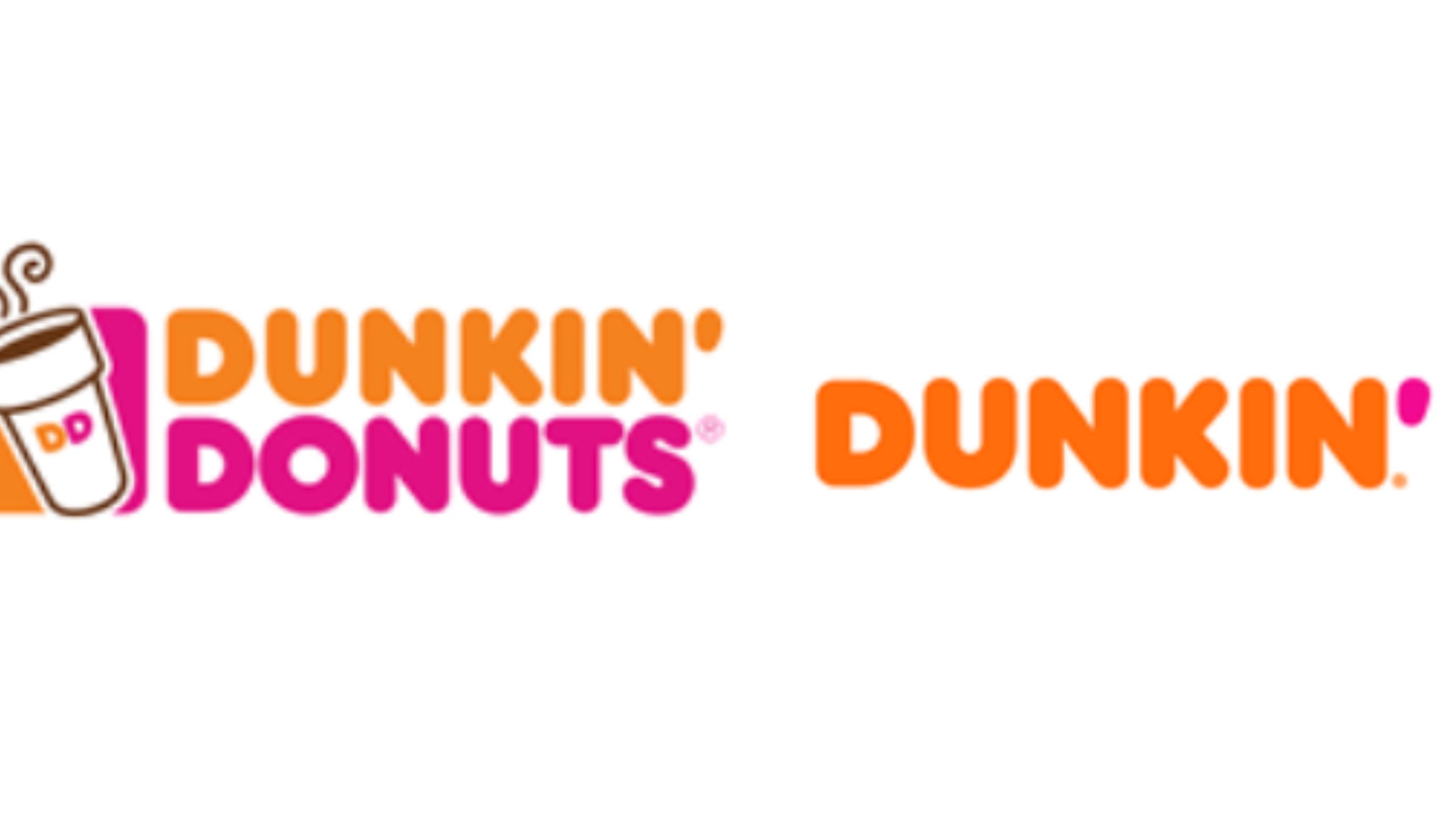
In 2018, Dunkin’ Donuts made the decision to drastically redesign its logo by dropping the word donuts from it entirely. The move was spurred by the company’s plans to move into other types of food and drink, although at this point everyone knows the brand primarily as a purveyor of doughnuts and coffee.
MAD Magazine
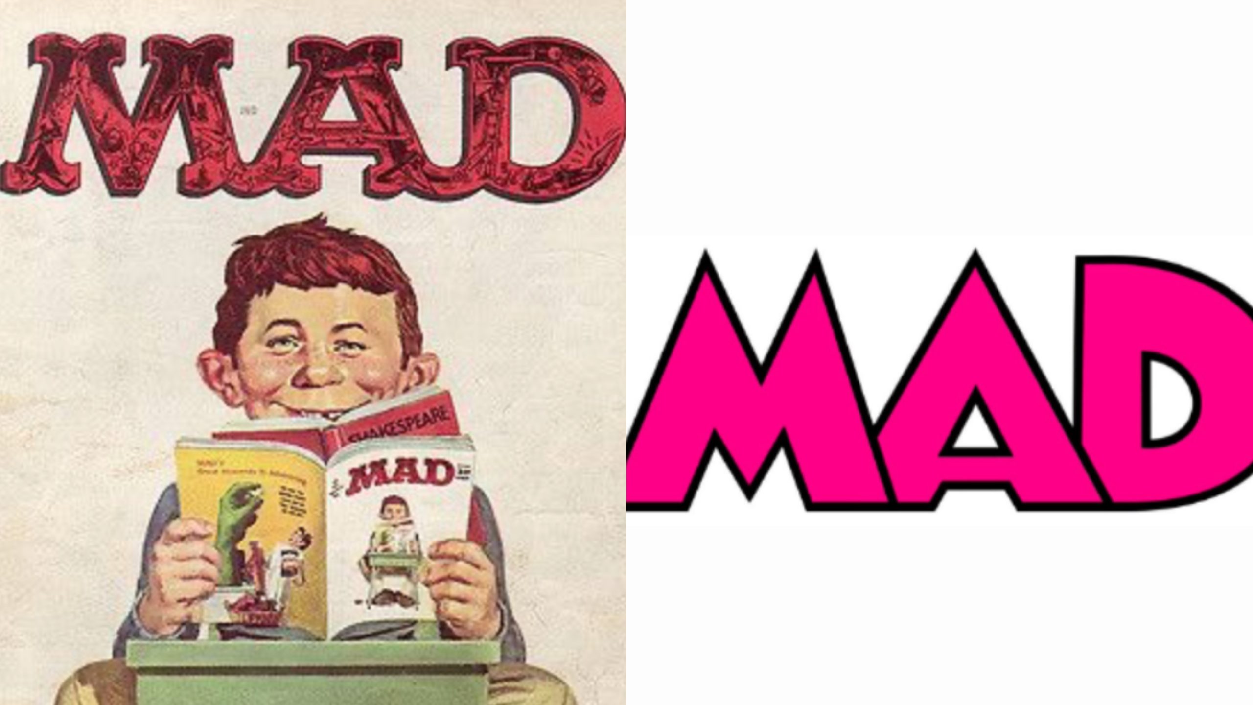
MAD Magazine’s logo – which had been used for most of the company’s 71-year history – was almost as iconic as the magazine itself. In 2018, the logo finally got a redesign, and it was a big one. Gone was the quirky font and red lettering, replaced with minimalistic lettering in bold pink.
ExxonMobil
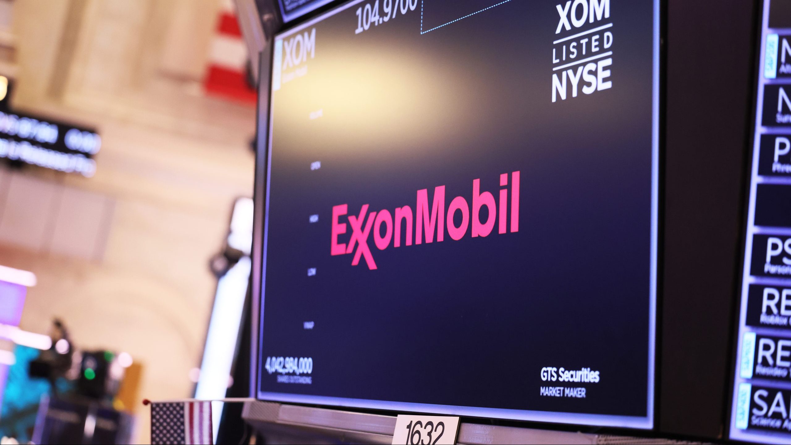
In the 1980s, Exxon and Mobil – both giants in the oil industry – were two of the largest companies in the world, with market caps worth tens of billions of dollars. In 1999, the two companies joined forces in what remains one of the largest mergers of all time, creating ExxonMobil, which continues to be one of the biggest players in the fossil fuels space.
Coleco
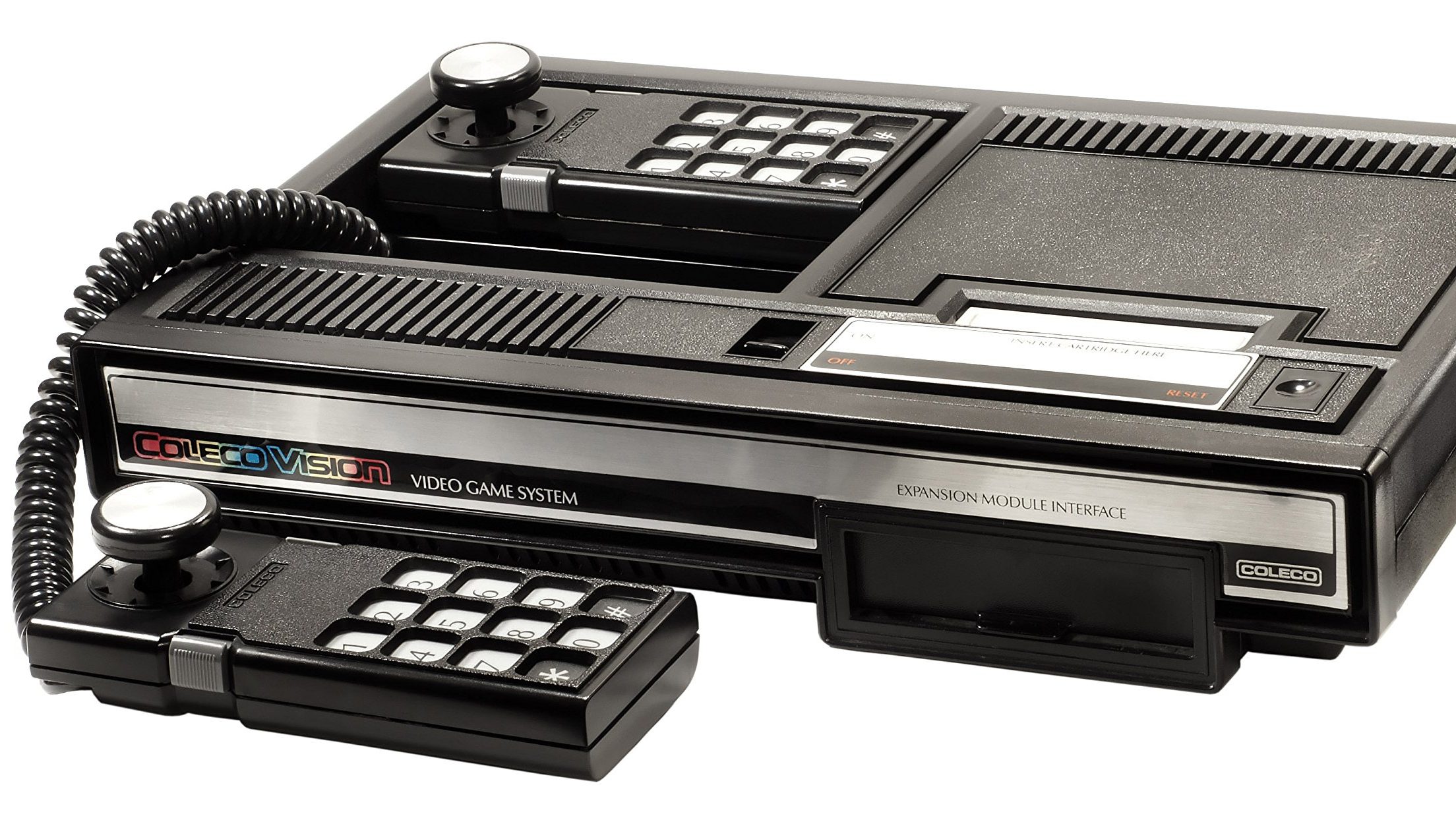
Although it was founded as a leather company, Coleco pivoted to making consumer electronics in the late 60s, and in the 80s the company got into the video game market with the release of its console the ColecoVision. After the video game crash of 1983, Coleco pivoted again, this time to making toys, which is what it’s mainly known for today.
Members Only
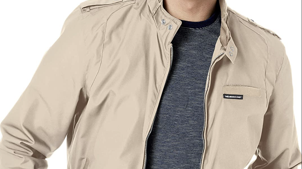
Founded in 1975, Members Only exploded in popularity during the 80s, with celebs like Madonna and Bruce Springsteen photographed rocking the brand’s iconic jackets. The company diversified its offerings in the years that followed, which broadened its appeal but diluted its edginess. These days, Members Only clothing can be found in high-street stores like Urban Outfitters.
Balmain Paris
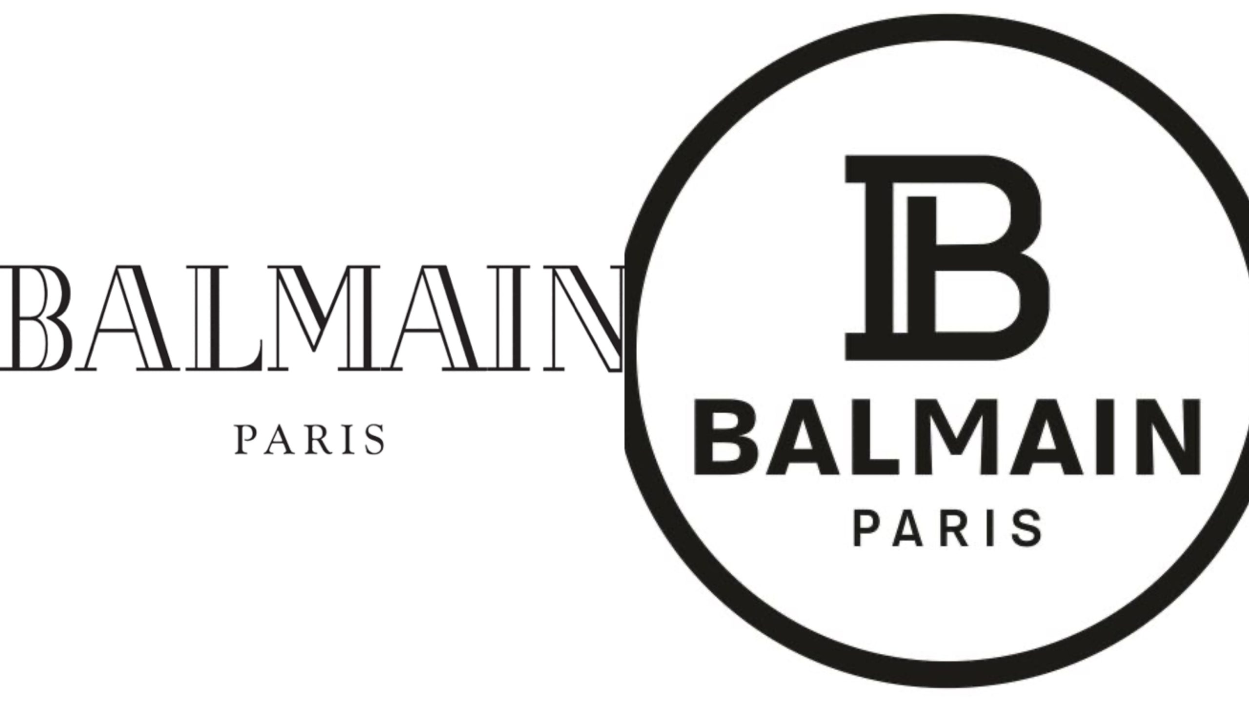
Founded in 1945 by Pierre Balmain, Balmain Paris has become one of the most revered luxury fashion brands in history. In 2018, the company introduced a new logo that featured a bold B with a P contained inside it. The new visual was intended to give the company a way of branding its clothes with a simple logo, rather than the full name, but it looks significantly less elegant.
Issey Miyake
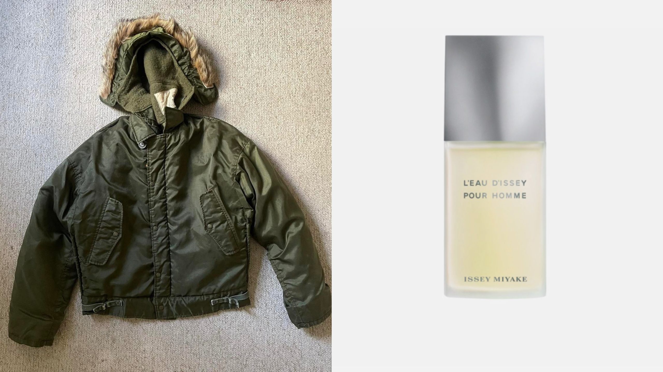
Issey Miyake was one of the hottest names in fashion during the 80s, with the Japanese designer’s unique patterns and materials enjoying widespread popularity. These days, the brand is more known for its fragrance lines, although it still manufactures a few high-end clothing offerings.
Ad Age
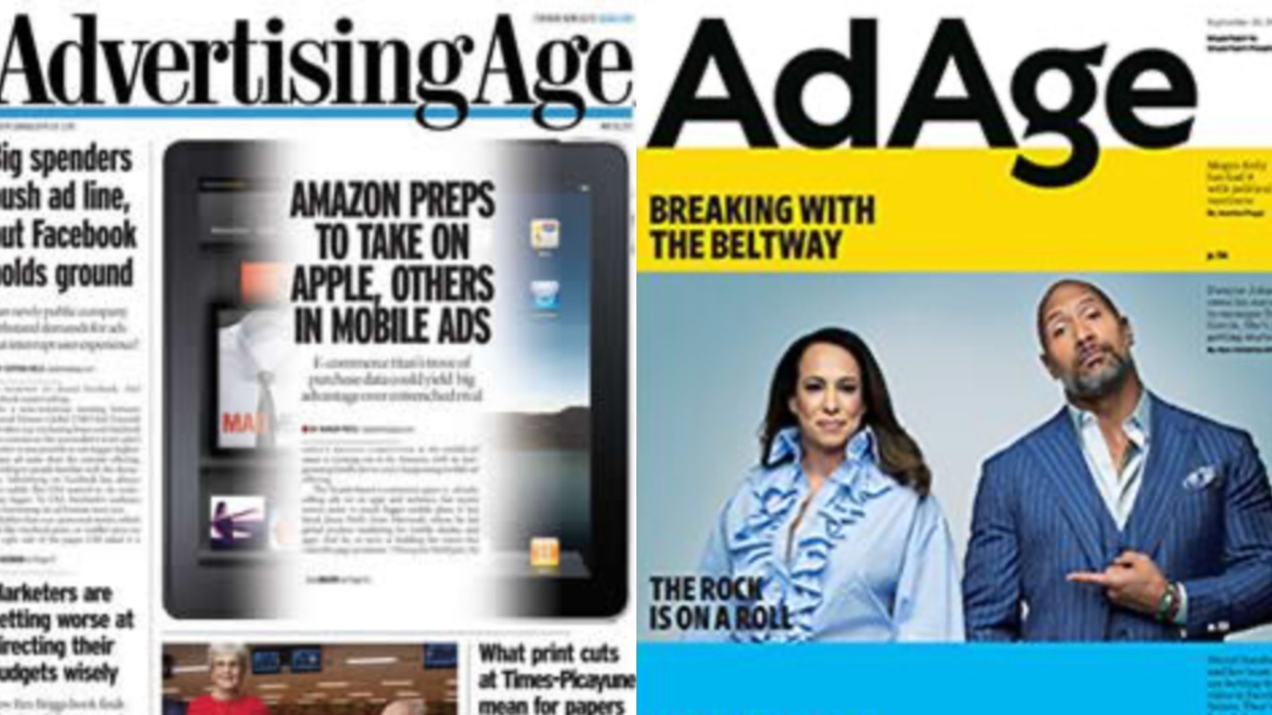
First published in 1930, Advertising Age quickly became a global leader in news and analysis from the marketing industry. In 2017, the company renamed itself to Ad Age, redesigning its logo in the process. Response to the changes has been generally positive, with designers and marketers praising the simplicity.
Xerox
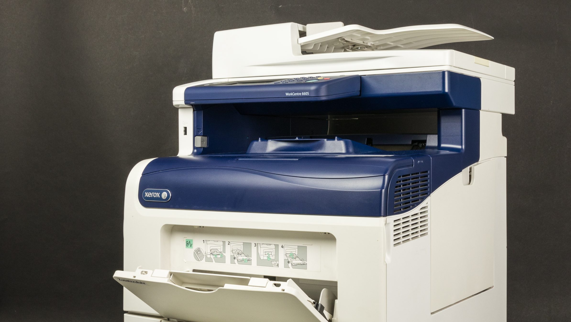
David T. Kearns took over Xerox as CEO in 1981, and – under his stewardship – the company became the largest player in photocopying and digital printing. Unfortunately, after Kearns’ departure in 1990, Xerox failed to innovate, clinging to its existing business model despite evidence that trends were changing. While the company still exists, it’s nowhere near as influential as it was once.
Benetton
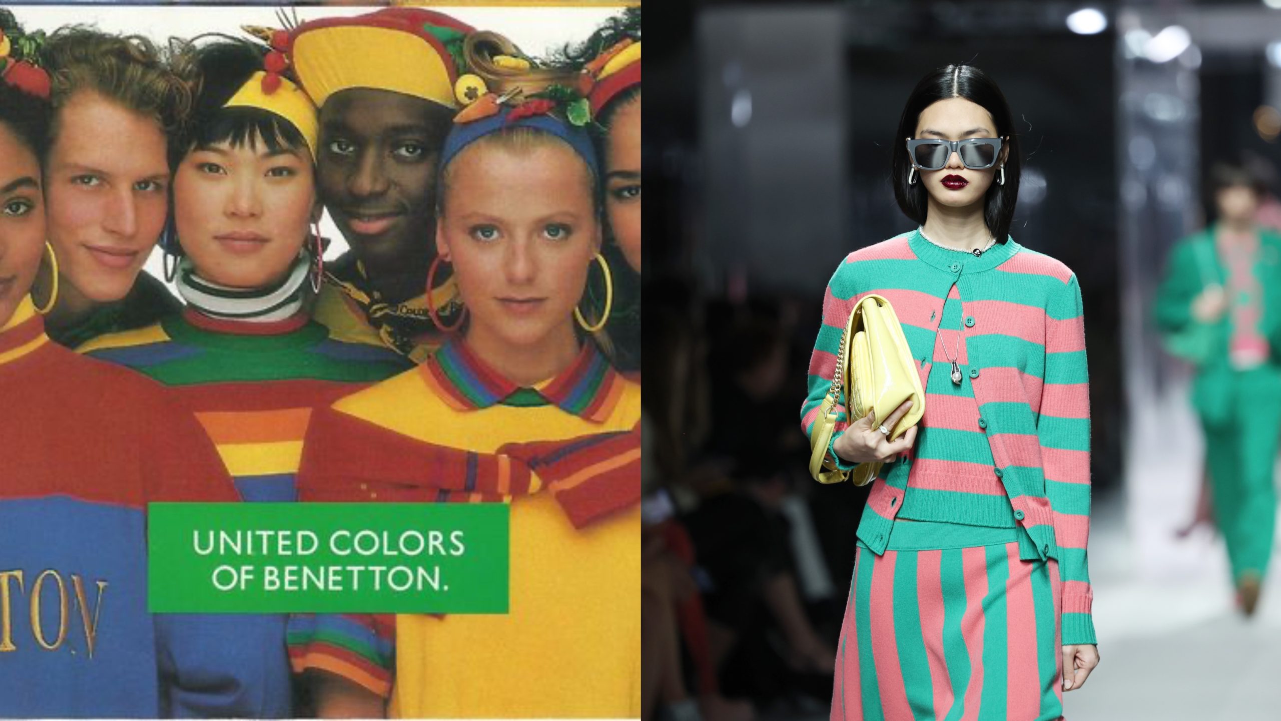
The first Benetton store opened in Italy in 1965, and by the 80s the brand was a global sensation. In 1984, Benetton launched its highly controversial “United Colors” marketing campaign, which drew attention to various world issues. The brand’s popularity waned throughout the 90s, and – while Benetton still exists today – it has failed to recreate its glory days.
NASA
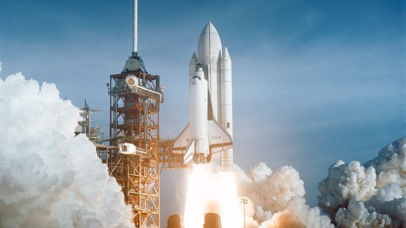
Although NASA’s last manned mission to the Moon was in 1972, the agency was still the global leader of space flight throughout the 80s. This started to change in the 2000s, as a lack of funding reduced NASA’s ability to launch missions. In the last decade, NASA has been partnering with commercial companies – notably Space X – to revive its space-flight programs.
McDonald’s
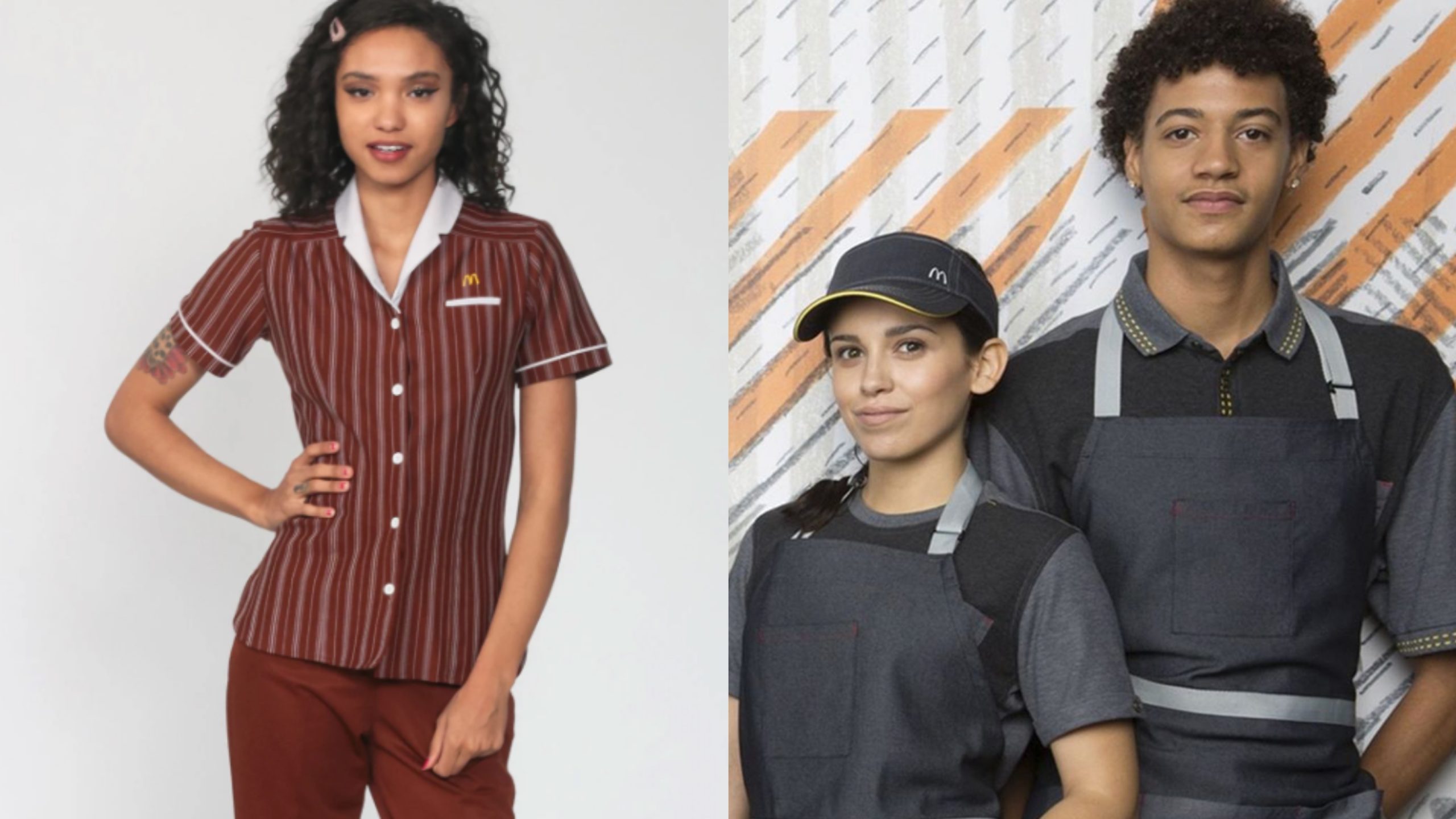
While McDonald’s food and branding have remained relatively stable since the 80s, the uniforms worn by its employees have drastically changed. Gone are the wing-tip collars and red pinstriped shirts, replaced by muted grey polo shirts which – while definitely more modern – are also considerably more dull.
Glamour

While most brands have modernized their logos by removing drop shadows and simplifying the font, Glamour magazine went in the exact opposite direction. The logo the company had been using since the 80s was remarkably modern and sleek, while the new version – which was introduced in 2018 – has a notably more retro feel.